Personal Finance Portal
Building a staff assisted platform for customers to apply for personal finance through portal and customer 360 application and in turn helping bank in saving time and processing cost.
Challenges
Amalgamation of sophisticated and complex functionality which were expected to be simplified to ease up the day to day activities of the user, need for a dashboard that gave the flexibility to access all work items at one go, too much information overload
Business Context
This project is related to a well-known alternate investment firm involved in providing fully integrated fund and corporate services. The firm specializes in providing fund administration, corporate secretarial, accounting, consolidation, tax and legal compliance, depository, and debt administration services. The firm primarily focuses on international private equity and infrastructure houses, real estate firms, private debt managers, multinationals, and capital markets issuers.
Solution
Since the project involved varied persona/ user base and is heavily data-centric. We incorporated personalization, data-visualization and progressive disclosure approach to segregate and present the data in a more logical and visually pleasing way. And we added neumorphic design approach to enhance and revise the overall look and feel.
UX Approach
UX Approach
Understanding User affordances & expections
-
1
Requirement Analysis – quickly understand expections and how well we can simplify
Understanding Business Goals
Competitor Analysis
-
2
Understanding Personas - usage and affordances
Information Design - Information Pirotisation, categerization, flow etc.
Creating Design system - complete style guide.
Wireframes, Mocks, Prototypes
-
3
Validating Technical Feasibility
Validating Usability and Design standards
-
4
Presenting and Reviews with Product owners/Business
Pega UI Development
User Testing and UX Expert Review
Some Hightlights
Some Hightlights
-
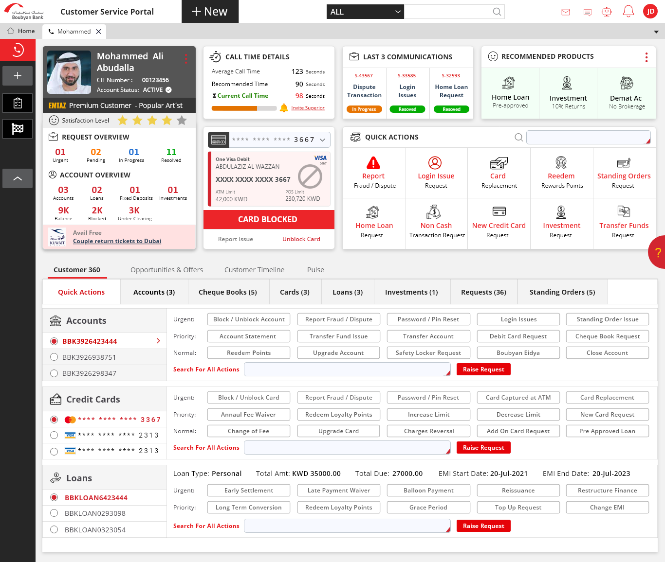
#1 Highlight - Information made easily accessible
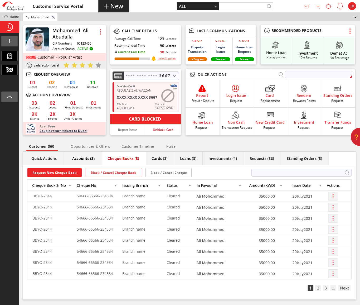
Upon speaking with the stakeholders, we realized that on a day to day basis the user would be needing few key work items to perform. Keeping this into consideration, we designed the dashboard in such a way so that the users could easily access all the required work items and also view their corresponding statuses to make their day to day activities a smooth sailing experience
 – 7.png)
-
#2 Highlight - Status Indicators
In order to bring users attention and at the same time to reduce the cognitive overload, we went with the status indicator approach wherein the key information like the request status (In progress/ pending etc) and similarly the number of standing orders, dependants etc were indicated through numbers. So that user can comprehend the data with ease and not get overwhelmed with too much information on the dashboard.
 – 20.png)
 – 16.png)
-
#3 Highlight - Data Visualisation
More focus was given to represent the key financial aspects like Assets (deposits, savings etc) and liabilities with the use of data visualisation elements like charts (bar chart, donut graphs etc). As the project involved financial data which were key elements and deciding factors, we emphasized on representing the same data using charts so that user can comprehend the data with much ease and analyse the data across timelines.
.png)
.png)
Final Mocks
Final Mocks
Mocks with dummy data to protect confidential information
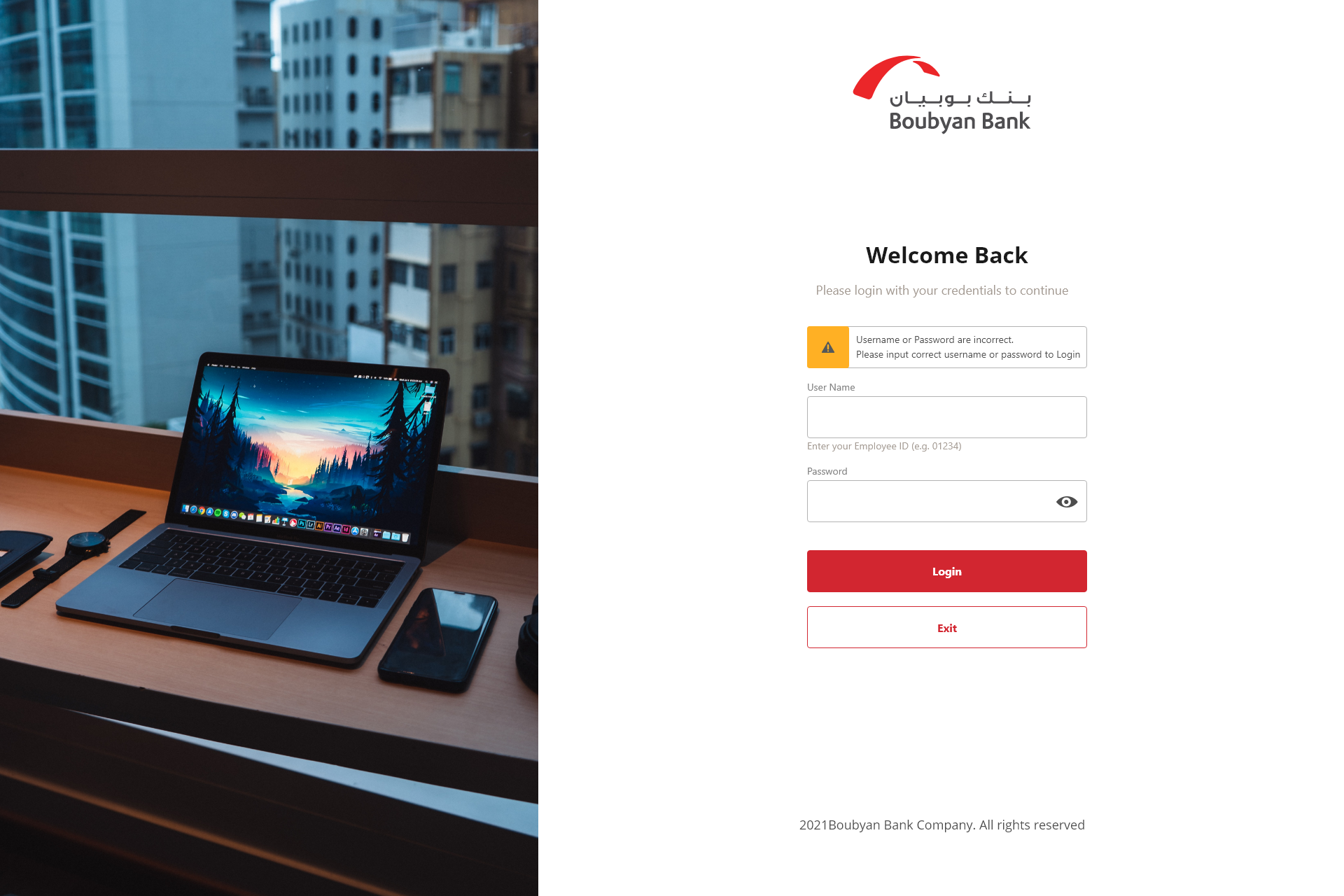
 – 20.png)
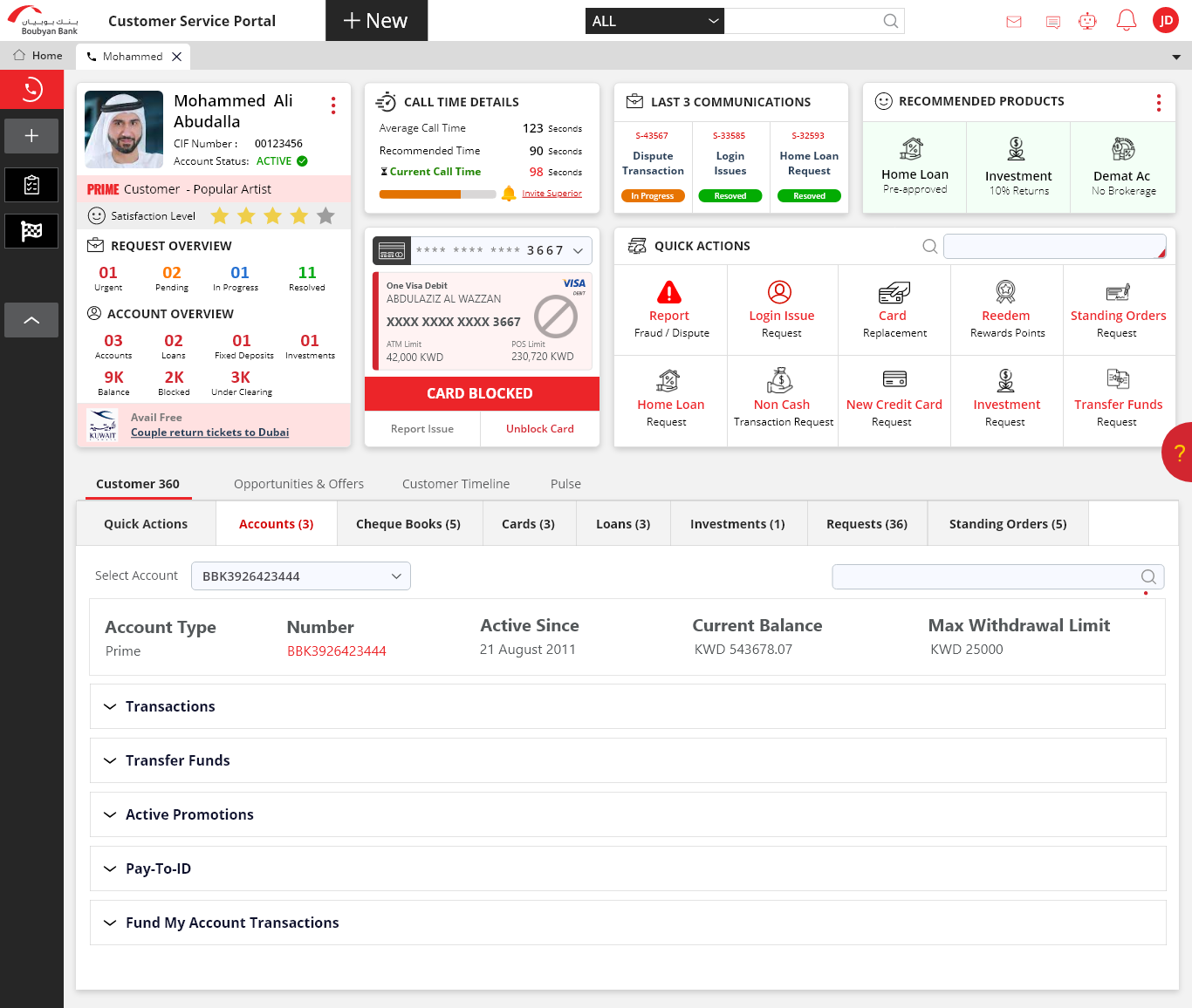
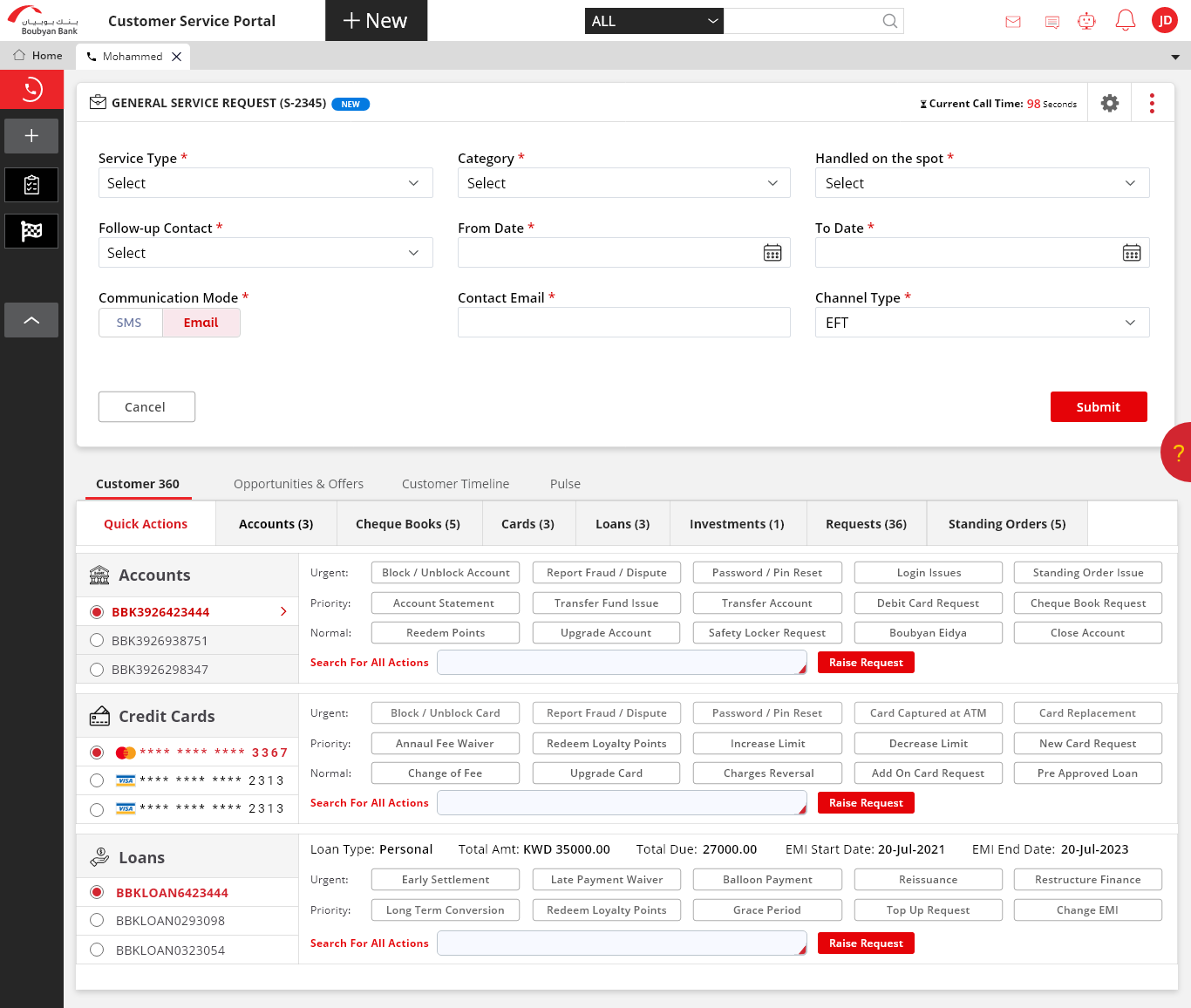
.png)
.png)
 – 7.png)
.png)
.png)
