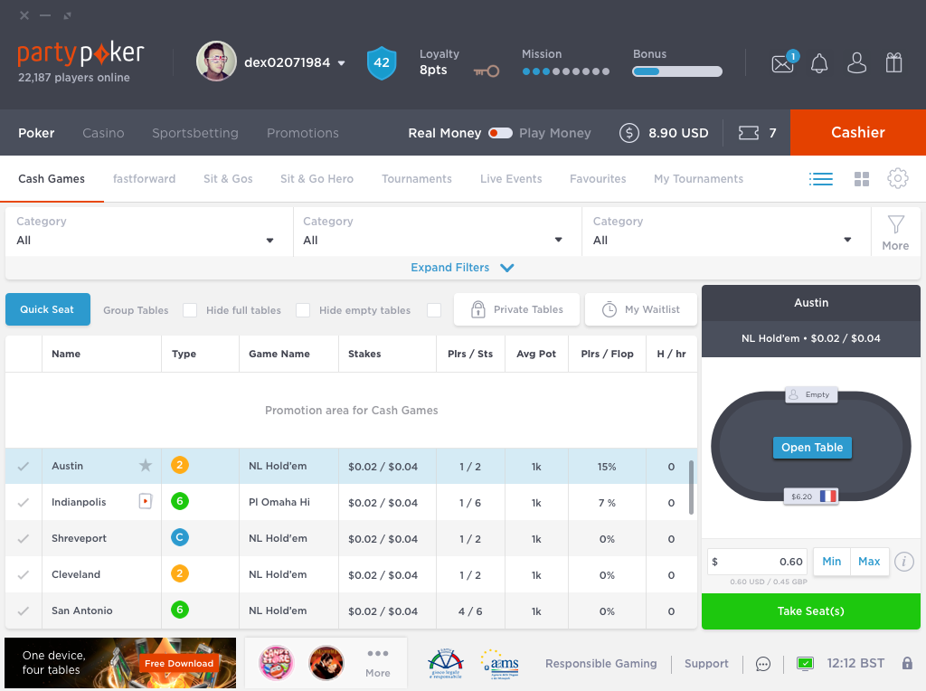
Is navigation intuitive enough?
Reviewing information architecture of Party Poker lobby LHN (left hand navigation) and identify the gaps.
Proposing required changes to the navigation tree to make it more predictable and intuitive with least possible modifications.
2.
Approach
Approach
Understanding infomation design gaps
-
Navigation usage stats – Use BI and analytics data and understand the current utility of different navigation options given in Party Poker Lobby.
Identify the obvious gaps / issues (if any) as per the numbers found in BI and analytics data.
Focus group sessions - to arrive at most intuitive navigation menu as perceived by the groups.
-
Evaluate the gaps identified, by comparing the focus group sessions outcome with the stats assessment outcome.
Give recommendations to fill the gaps with a minimum impact on the current user experience.
3.
Analysis
Analysis
Finding based on BI and Web Analytics Data
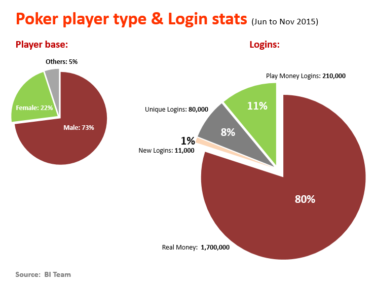
Finding Overview
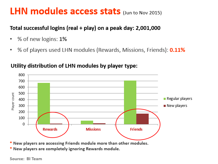
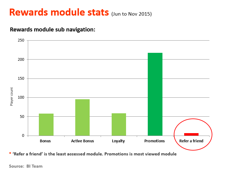
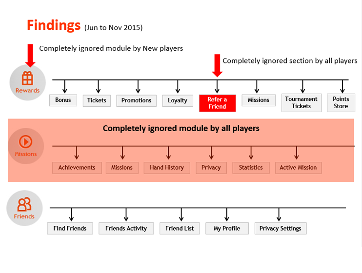
New players are accessing Friends module more than other modules and completely ignoring Rewards module.
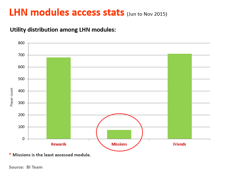
Missions is the least accessed module.
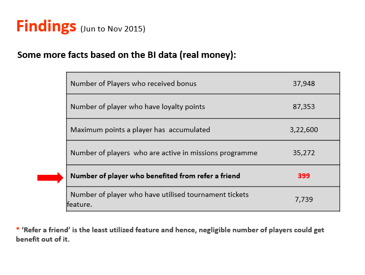
Refer a friend’ is the least accessed module. Promotions is most viewed module
With the present scenario overall views for 3 modules is comparatively less to number of logins, in which Friends & Rewards has better views compared to Missions Module.
4.
Analysis based on Focus Groups
Analysis based on Focus Groups
Understanding how Information is preceived among Focused Groups
Groups we choose: 3
Young , Non – Experienced Tech Savvy
Experienced Tech Savvy
Experienced but not Tech Savvy
None of the above are familiar with our Poker client
Each group size: 6
Time Duration for each group: 45 Mins
Motive: To understand how various groups based on their past and present experiences, how they perceive and expect our information flow to be.
Activity Brief: Asked the individual groups to identify the given info and based on their understanding and online experience, they should group them into the 5 given modules
Constrains we kept: Considering 5 modules ( Rewards, Mission, My Account, Friends & Options )
Retained the existing modules names as it is.
Method: Interactive session while using sticky notes to capture their views
Young and Tech savvy – outcome
| Rewards | Missions | My Account | Friends | Options |
| Bonus's | Achievements | Loyalty | Refer a Friend | Statistics |
| Promotions | Active Mission | Loyalty Points | Messages Inbox | Hand History |
| Points Store | Friends Activity | Privacy | ||
| Points History | Find Friends | Message Settings | ||
| Inter Account Transfer | Security Settings | |||
| My Statements | Inter Account Transfer | |||
| My Profile | Stacking | |||
| Change Profile Pic | Table Options | |||
| Real Money Balance | Change Table Style | |||
| My Activity | ||||
| Privacy | ||||
| My Details |
Experienced and Tech savvy – outcome
| Rewards | Missions | My Account | Friends | Options |
| Promotions | My Activity | Message Inbox | Find Friends | Privacy |
| Tickets | ||||
| Points History | Active Mission | My Activity | Friends Activity | Change profile pic |
| Achievements | ||||
| Points Store | My Points | Refer a Friend | Security Setting | |
| Loyalty points | Hand History | Message Settings | ||
| Loyalty | Real Money Balance | Table Options | ||
| Tournament Tickets | Change Profile Pic | Stacking | ||
| Bonus's | My Profile | |||
| Inter Accout Transfer | ||||
| My Statements | ||||
| Statistics |
Experienced and not Tech savvy – outcome
| Rewards | Missions | My Account | Friends | Options |
| Refer a friend | Achievements | Hand History | Find Friends | Security Setting |
| Inter Account Transfer | ||||
| My Points | Active Mission | Change Profile Pic | Friends Activity | Message Settings |
| My Profile | ||||
| Promotions | My Activity | Privacy | Privacy settings | Table Options |
| My Statements | ||||
| Points Store | Message Inbox | Stacking | ||
| Real Money Balance | ||||
| Loyalty Points | Bonus | Statistics | ||
| Message setting | ||||
| Tournament Tickets | ||||
| Points History |
Comparing and merging 3 groups views with our current information grouping
| Rewards | Missions | My Account | Friends | Options |
| Bonus | Achievements | My Details | Find Friends | Table Options |
| Tickets | Missions | My Inbox | Friends Activity | Multi Tabling |
| Promotions | Hand History | My Points | Friends List | Stacking |
| Loyalty | Privacy | My IAT | My Profile | Basic |
| Refer a friend | Statistics | Inter Account Transfer | Privacy Settings | Advanced |
| Missions | Active Mission | My Statements | Tournaments Tickets | |
| Tournament Tickets | ||||
| Real money Balance | ||||
| Points Store | ||||
| Loyalty Points | ||||
| Tournament Dollars |
Other Observations:
Module names: This has lot of influence in the way people perceive the options under them. Some of our module names are bit confusing, leading to conflicts in expectations. As a result, information grouping is overlapping between the modules.
Missions – many could not understand what it is.
Options – Too generic and doesn’t set clear expectation.
My Account: As we have specified “My” here, most of the people are expecting anything & everything related to ‘self’ under this module. So, lot of non-account related stuff is also expected here.
Options: When tried changing the name to “settings” it made more sense as most of the individuals could relate well than Options.
5.
Visualising the mock
Visualising the mock
After the intial validation further study was done with Real Users which resulted in below Updated Design