Making Registration quick and easy
Review and identify the pain points.
Propose changes which makes the overall process quick, easy and simple
Approach
Approach
Understanding design gaps and possiblities
-
Expert Review – to quickly understand usability and information pirotisation
Mapping the finding / issues with BI & analytics data.
Sample user testing - to observe the time taking process and how information is preceived.
-
Cordinating with tech teams to understand the constains and possibilities of quick changes
Give recommendations and propose design solution which can be implemented quick.
Analysis
Analysis
Finding based on User testing and Analytics Data
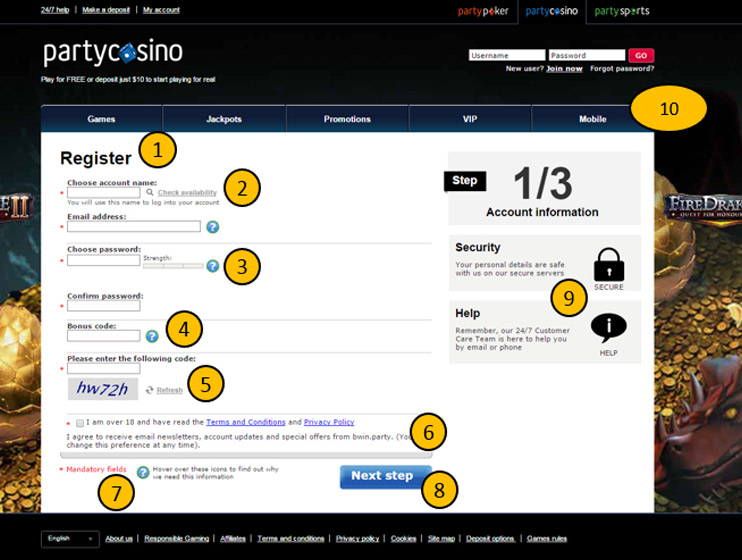
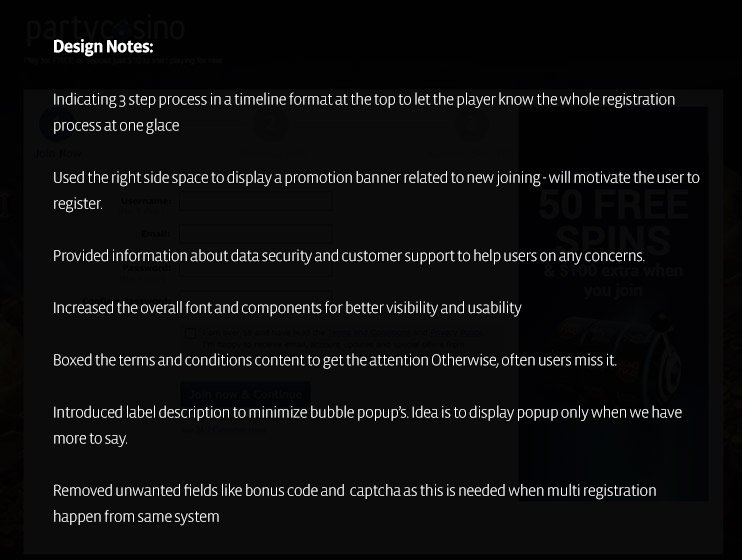
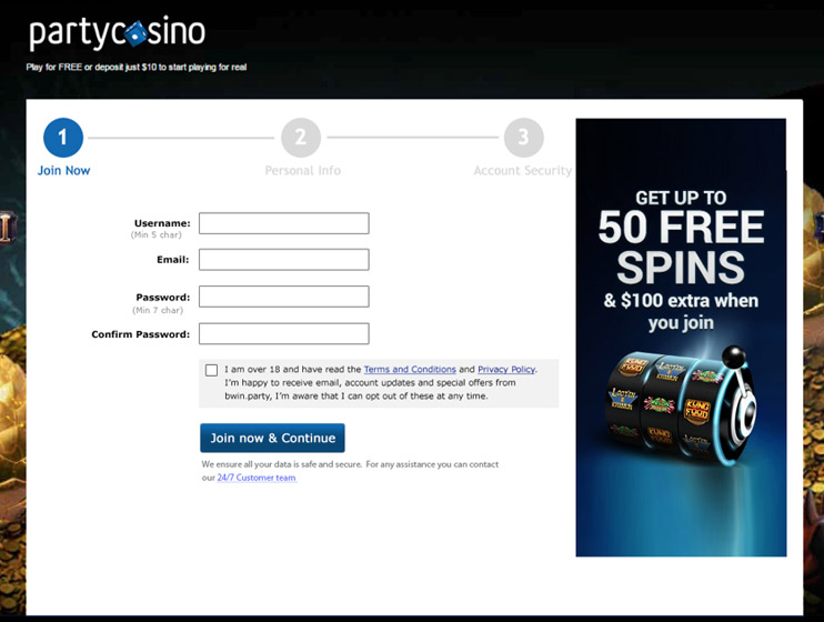
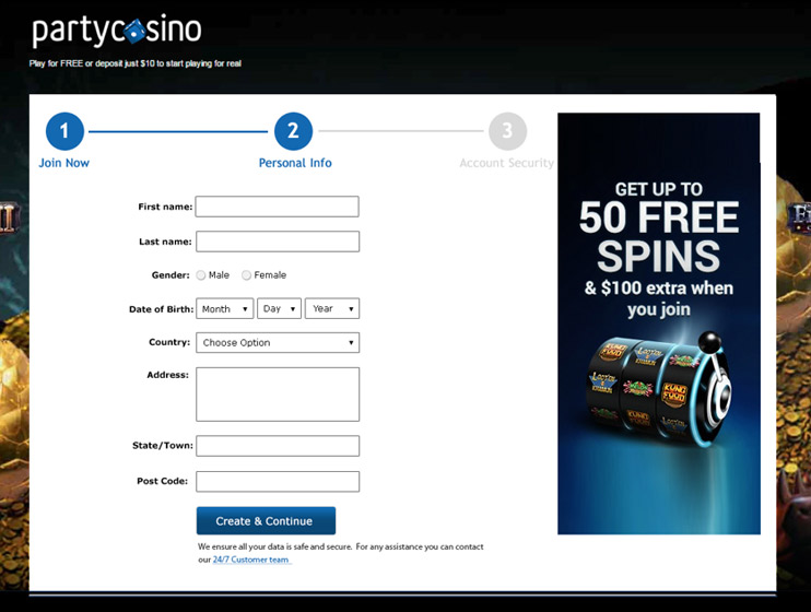
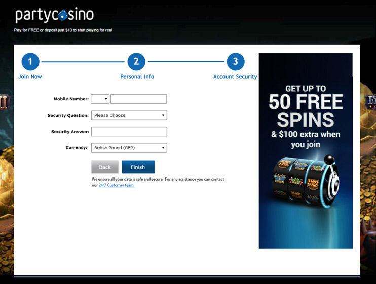
1: User clicks ‘Join Now’ to get here so page should say the same.
2: Check availability link and text removed. Text will be in information bubble. Availability check on field exit. Account name changed to username, it’s called this in the login boxes.
3: Question marks not needed. Information will be displayed when user is in field. Strength indicator removed as not noticeable.
4: Bonus applied automatically so not needed here.
5: Captcha only required with repeated logins from same IP (bwin are implementing this)
6 All unnecessary visual clutter removed. Text tightened up. Check box in line with fields above.
7: All fields are mandatory so no need to say so. Question mark key removed.
8: Button moved to be in line with other form items.
9: Unnecessary items removed.
10: Remove extraneous navigation elements during registration process.
Re-designed Visual Mocks
Re-designed Visual Mocks
Understanding how Information is preceived among Focused Groups